10Twelve
10Twelve
10Twelve
JLL
Branding, Advertising Campaign, Photography, Leasing Brochure
What do you get when you combine the the personalized approach of a boutique leasing firm with the resources of one of the largest commercial real estate companies in the world? Jones Lang LaSalle’s newest best-in-class (and best-in-design, if we do say so ourselves) leasing group: 10twelve.
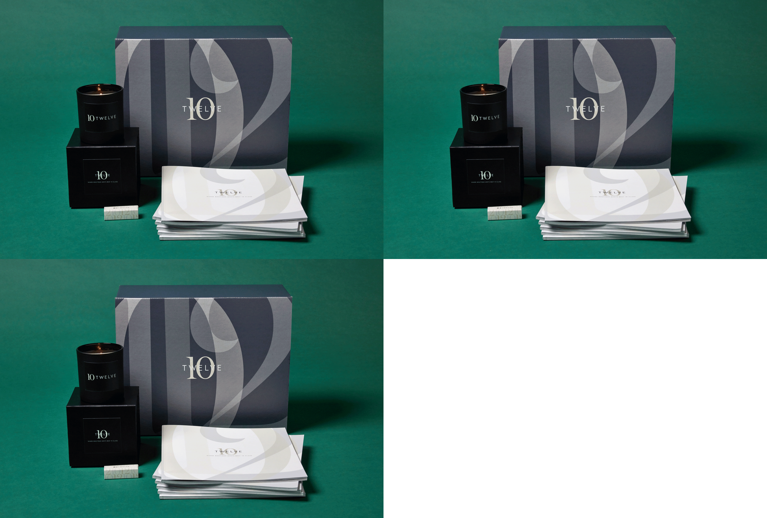
To counter the reputation big companies can get for being large, impersonal, with one-size-fits-all solutions, JLL reached out to us for help in creating a premier retail leasing arm that would appeal to the speciality trophy projects looking for that personal touch and exclusive service.
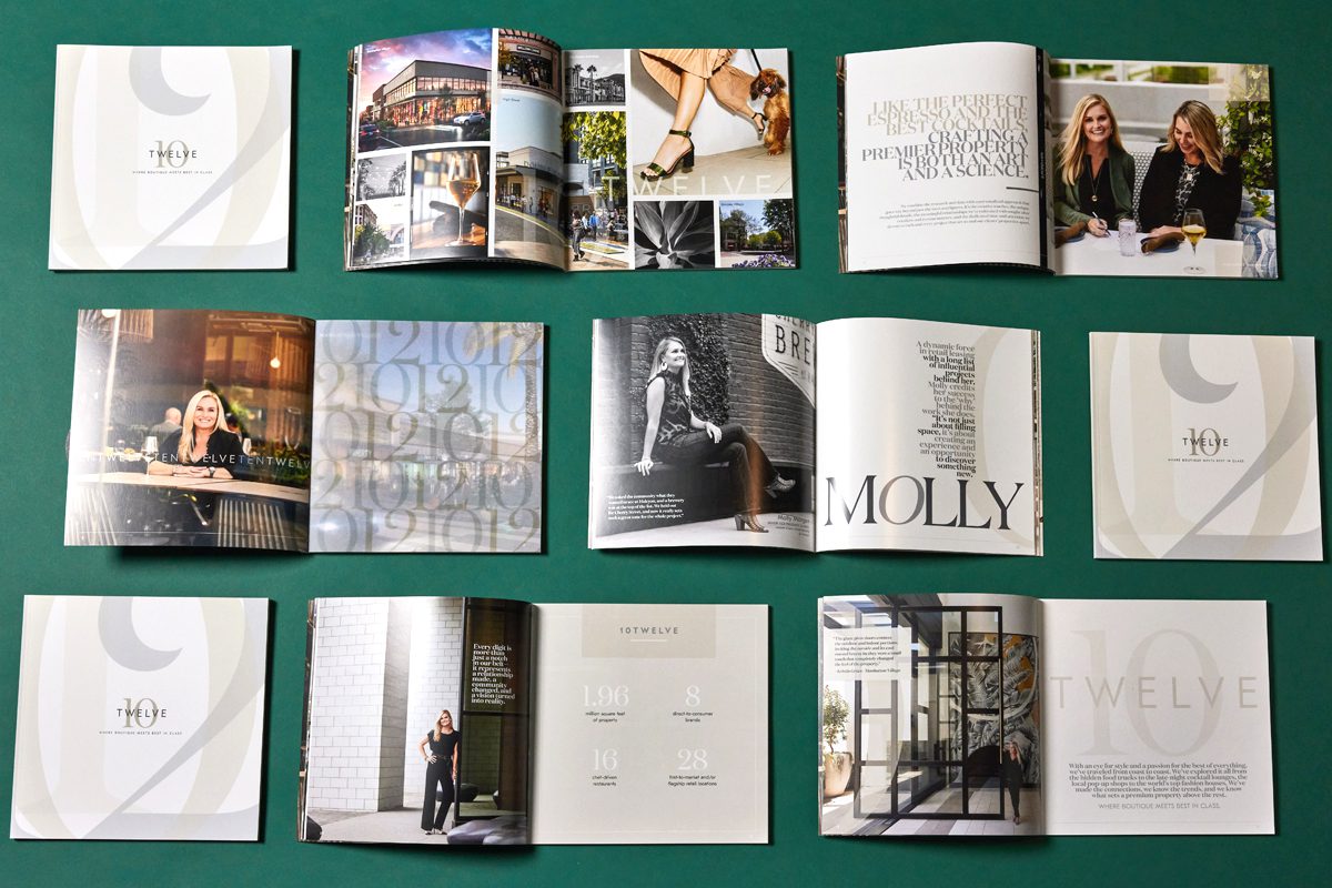
In creating a name, logo, brand, and leasing materials, the challenge would be that the new offshoot needed to be differentiated and elevated from JLL’s brand to distance themselves from the big company vibes, while still being part of the JLL family and adhering—albeit in a literal sense—to the brand guidelines.
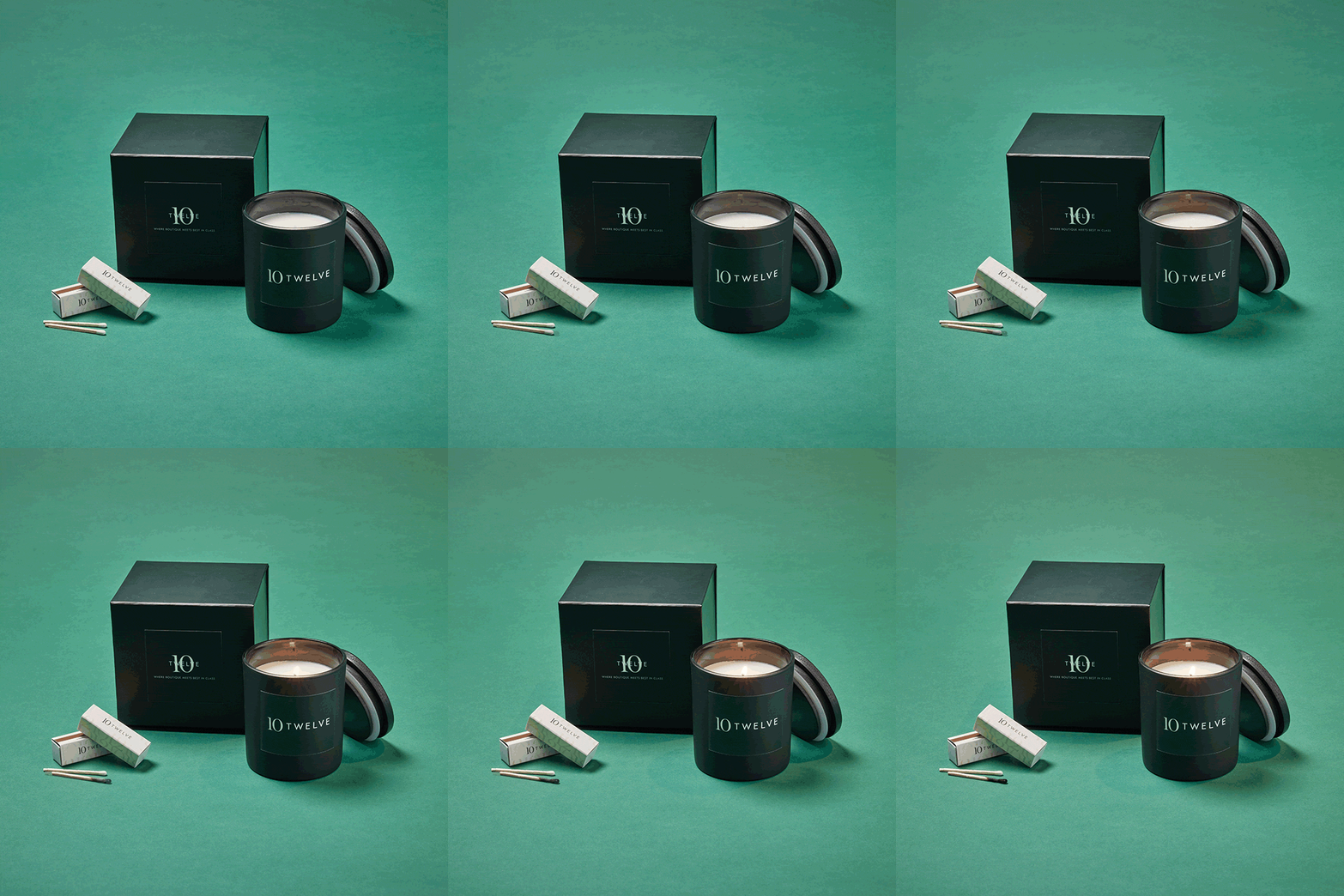
Because we love a good IYKYK, we came up with a name that wouldn’t be obviously associated with the company, while still giving it a secret nod: J being the 10th letter of the alphabet and L being the 12th letter, 10twelve = JL(L). Ya see what we did there? *winks
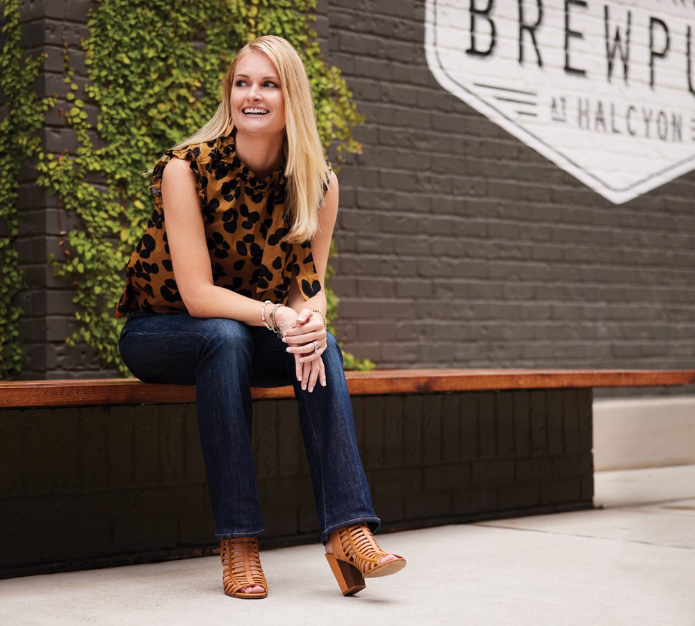

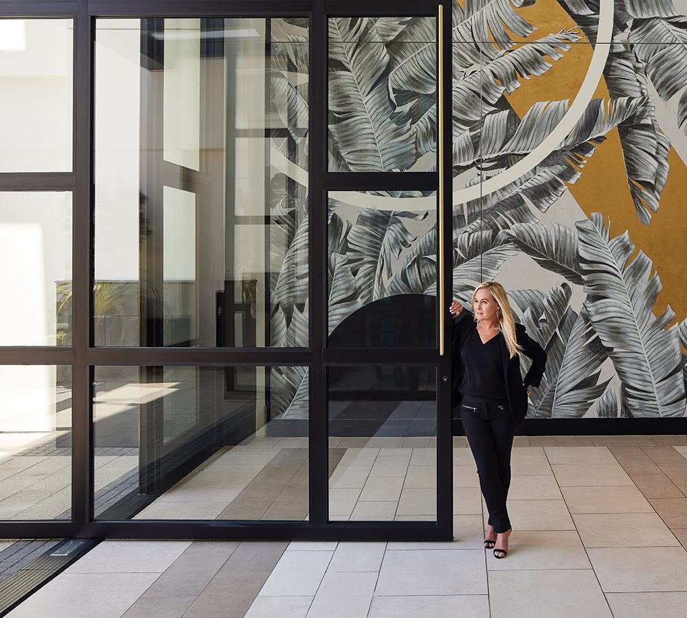
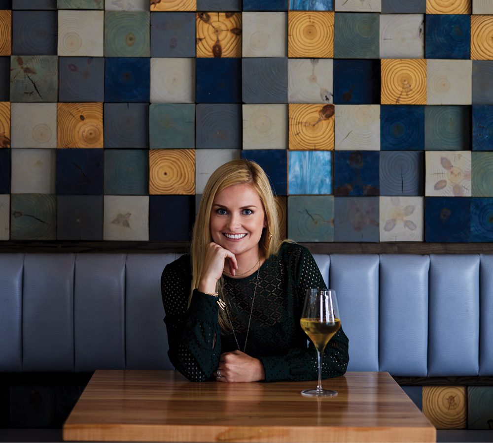
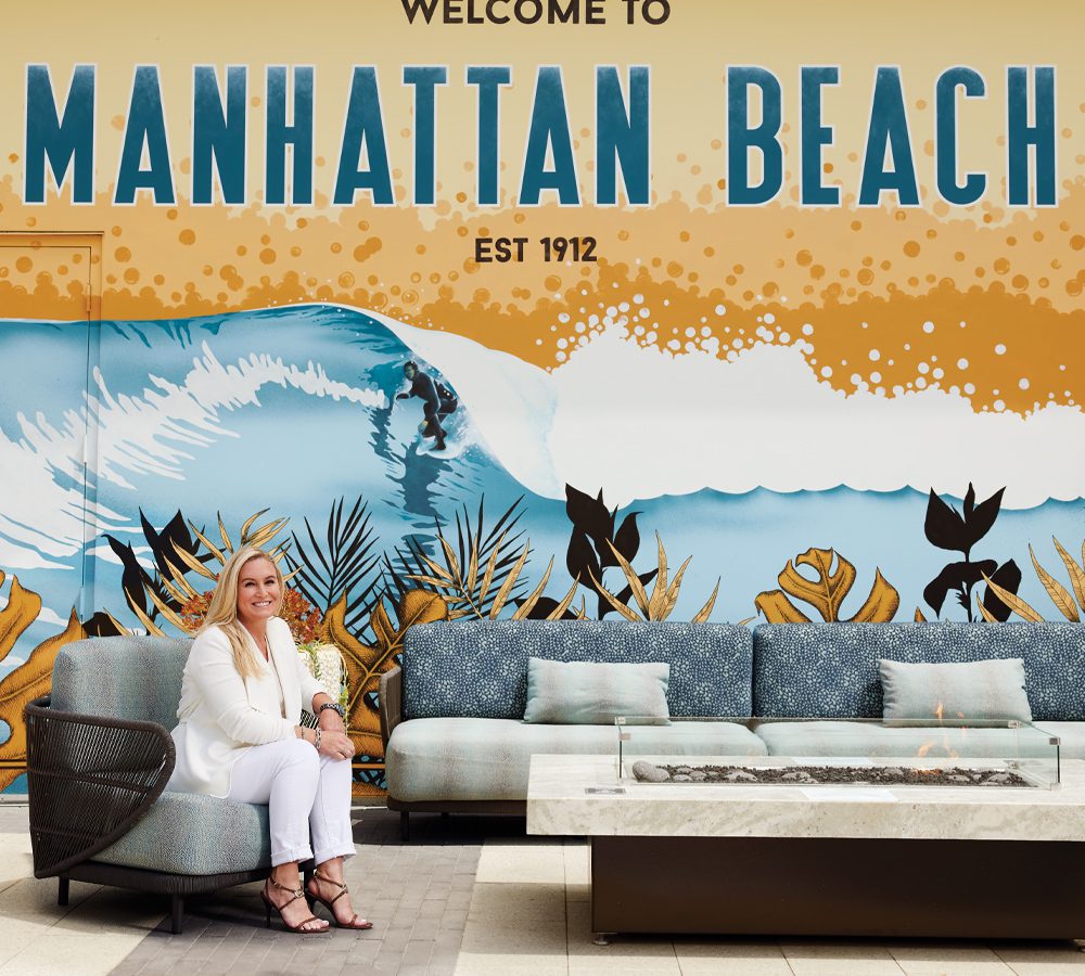
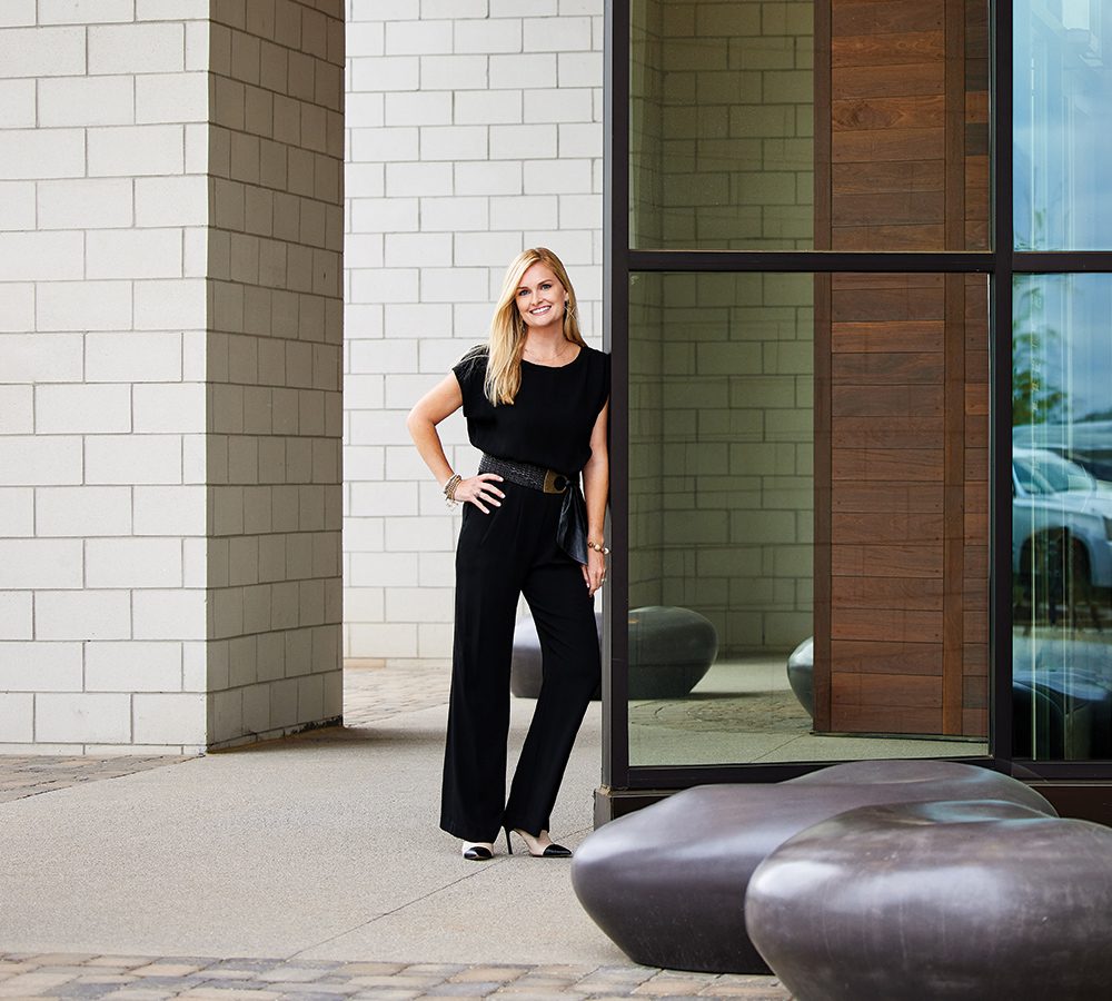

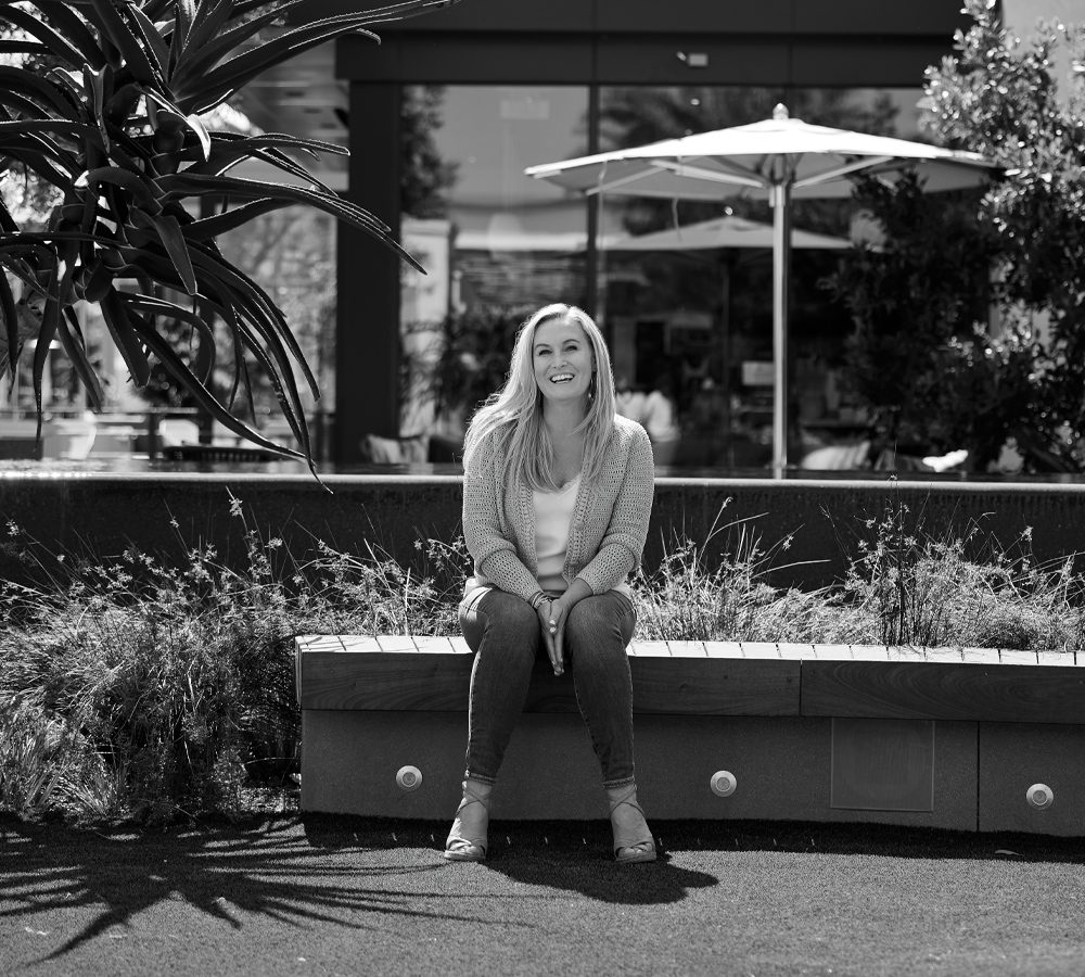
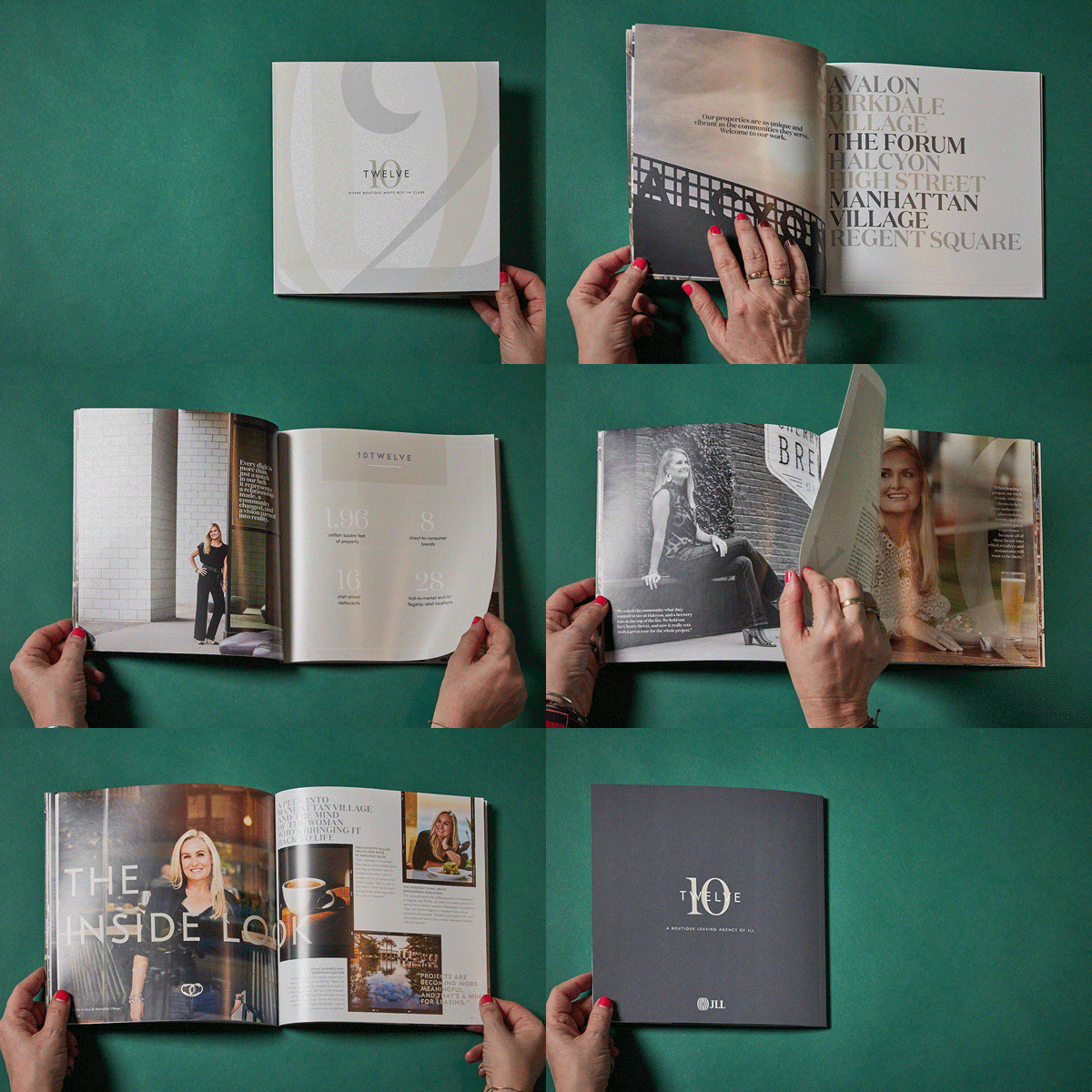
To really set this premier team above and beyond, we created an elevated, magazine-inspired leasing brochure that not just highlights the incredible properties this group has under their leasing belts, but the incredible women behind the work. With custom photography by Scott Lowden shot on their portfolio properties and messaging that goes beyond the surface to showcase their personal ‘why’ they do what they do, each element tells a story of a relationship-focused team with outstanding results.
We downplayed JLL’s bold red and black brand colors and leaned into its neutrals to add sophistication while still staying within the brand palette.
